BLOGOGRAPHY

Typographic Aggression!

June 7, 2017


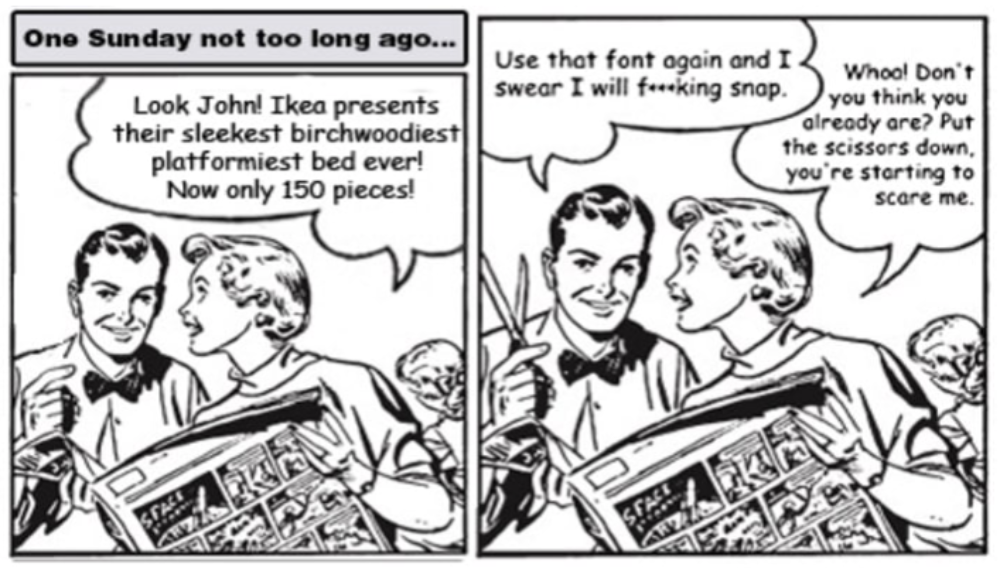
Recently, Ikea unveiled its new catalogue, and designers began complaining almost immediately. To laymen, the problem is probably almost invisible: Ikea has changed its official font from Futura—with its tony design pedigree—to Verdana.

So what? Verdana was designed as on on-screen font for Microsoft. And while it's serviceable in that context, it was never meant for print. Designers would liken that move to driving a Honda Civic around a racetrack—sure the Civic might be a fine family car, but it doesn't have the elegant engineering required to race in the main event. Ikea, with it's history of design excellence, is supposed to know better. Time and NPR have already reported on the controversy, and there's now an online petition demanding Ikea reverse course. Grrrrrrr.
 

Typefaces of the Homeless

June 4, 2017
Typefaces based on the handwriting of homeless people in Barcelona are up for sale at homelessfonts.org. All proceeds go to the Arrels Foundation, an organization for the benefit of Barcelona's homeless. 


Beginning Graphic Design: Typography

June 1, 2017
This is a nicely presented little video, laying out the basics of typography. While I don't necessarily agree with everything that is said within the video, like leading, it is still fun to watch if you are a beginner at typography. Enjoy!


Steven Heller: On Creativity

May 31, 2017
 

More reasons why we need to proofread and need graphic designers

May 31, 2017
One can only hope that the top image has been Photoshopped. Nevertheless I thought it was funny. Surely somebody isn't that inept!


NOT Proofreading is Costly!

May 29, 2017


10 steps toward good typography

January 29, 2017
Here's a nice little video covering the very basics of good typography. It is especially helpful for those who are new to design. Click here!
 

The Prints and the Pauper: Johannes Gutenberg and the invention of movable type

January 16, 2017

I found the below article on I Love Typography and have copied it here for your convenience. To see the original article, please visit I Love Typography's excellent website. Keith Houston, the author, is the founder of shadycharacters.co.uk. His latest book, The Book: A Cover-to-Cover Exploration of the Most Powerful Object of Our Time, is available now from W.W. Norton & Co.
______________________________________________________


In 1450, Johannes Gutenberg entered into an agreement with one Johann Fust, a Mainzer goldsmith and guildsman, to borrow a staggering 800 Rheingulden at 6 percent interest. Gutenberg’s sales pitch must have been convincing, for Fust would later testify that he himself had borrowed money in order to fund the loan. Gutenberg sank the money into his workshop and promptly defaulted upon the interest payments. Fust must have been incandescent in his rage, and yet, two years later, as recorded in the inevitable court judgment, he would go on to lend Gutenberg another 800 Rheingulden on the condition that Gutenberg take on Fust’s adopted son, Peter Schöffer, as his foreman. Gutenberg assented, Schöffer was hired, and Fust paid out the second loan.


Shadow Type Book Review

January 13, 2017
With this book, enjoy more than 300 typography examples of dimensional lettering incorporating elements of relief and shadow from Europe and the United States. The examples come from a variety of sources, from type-specimen books and billboards, to shop signs and posters, all of which were created between the nineteenth and mid-twentieth century. Here’s an inspiring promo of the book and what you may expect to find within its pages:


The History of Typography

January 3, 2017
A paper letter-animation about the history of typography.


Me, Who Else?


Erich Shelton I am a retired adjunct professor from the University of Southern Indiana, located in Evansville. My favourite subjects to teach are obviously ‘Typography’ as well as ‘Graphic Design History’, 'Senior Seminar' and ‘Computer Illustration.’